I try to keep any FSE WordPress site as much “in WordPress” as possible. Using in-built tooling for things like layout, colors, typography, etc. So most of this site is built using that approach. There are several areas that were complex enough to still need a more traditional “Add a Class” approach to achieve their desired styling and I’ll outline those here.
Menus
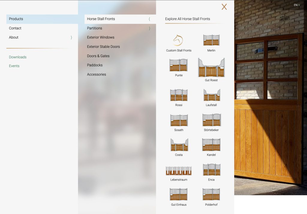
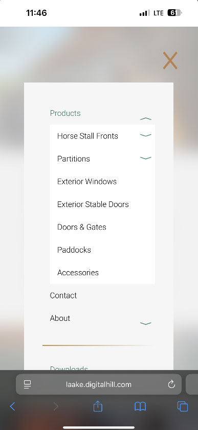
Menu is in pretty good shape, and will fall back to a more simple accordion for mobile. I did take one small design liberty, changing the center pane from #F6F6F6 to rgba(255,255,255,0.5) and blur(20px)… I can change it back to a solid color with a single line of CSS… but like IDK I thought it would look cool. While the Original “DHWP Navigation” can used either “Classic Menus” or “Gutenberg Navigations”, this child block “DHWP Navigation Slider” can ONLY use Classic Menus. This is probably fine, since when we discussed this site all parties had preference for classic menus anyway.
Icon images are attached to each page, but will only output when that page is in the 3rd level of the Menu hierarchy. I experimented a little with adding the Iconography to the 1st and 2nd panels / levels of hierarchy… but unless every item had an image it looked pretty bad, and also made an already pretty complex nav even more complex, so unless specifically requested, IMO it actually works better without being able to have icons in the 1st and second panels. This does however mean that any items we do want to have icons must be in the 3rd level of hierarchy. Finally, only 3 levels of hierarchy are supported for this sliding navigation at this time, while 4 are supported on the stock “DHWP Navigation” block, and potentially unlimited in the stock WordPress Navigation block.
Desktop
Mobile
Homepage
Topbar – The has some advanced features. Both at the global level in customizer, and at the per-page level the colors, and scroll colors, for the header can be set. Additionally, I have added the more subtle gradient with CSS. By combining these effects, once can acheive a semi-transparent topbar that will work well with any page’s hero image.
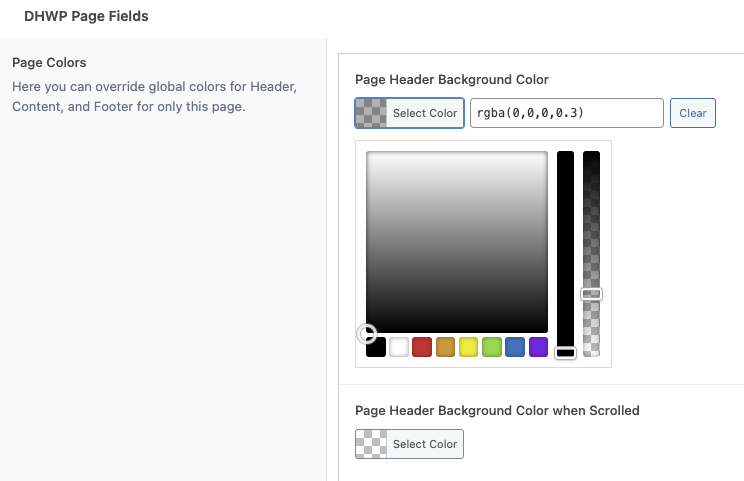
Here on the homepage, we can keep the largely invisible topbar with only the gradient and no other background. In the page settings for the contact page, I set the “Page Header Background Color” to rgba(0,0,0,0.3)…

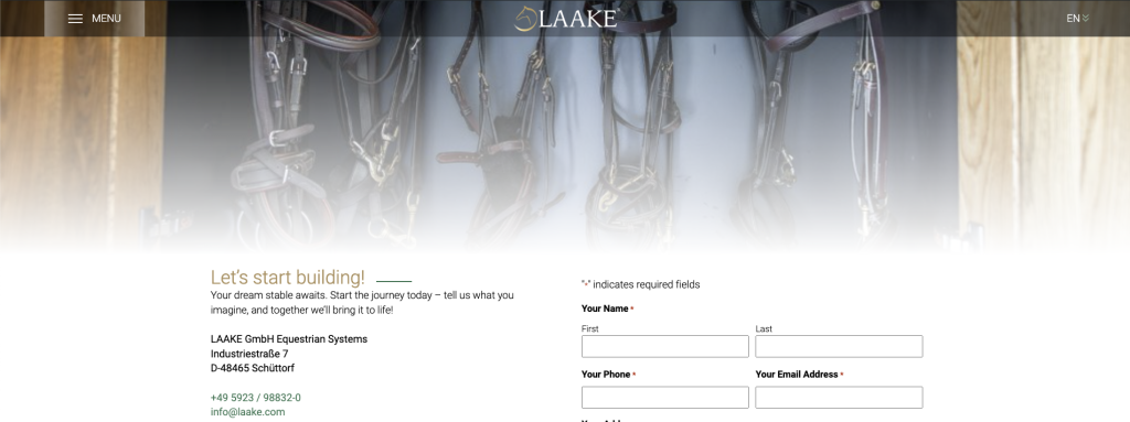
However, on some of the inside pages, the image at the top, or the white gradient overlay is causing the top of the image to be substantially lighter… which in turn lowers the contrast on the header text and Laake logo.
So, for example on the Contact page, I set the Page Header Background Color to .3 black…
On the front end, we get the darker header for better contrast (against any background).
Heading Accent

There were many ways to handle the little accent line after the Headings, and I think I’ve come up with a good one. It is very flexible, and very customizable, but it does need a few steps to set it up. To do so, I have taken over the Separator block that is in-built to WordPress.
Firstly, wherever this is used, it should be a Row, with a nested Heading and a Separator.
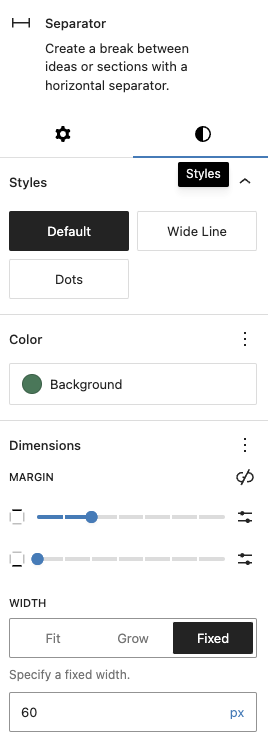

By setting the separator settings about like so, we get the practical effect we want, but even better, since I’m using the “Animations for Blocks” plugin, the Animation for each of these accents is configurable. And, by using the “Wide Line” or “Grow” settings we can make a thicker or longer line if we want.
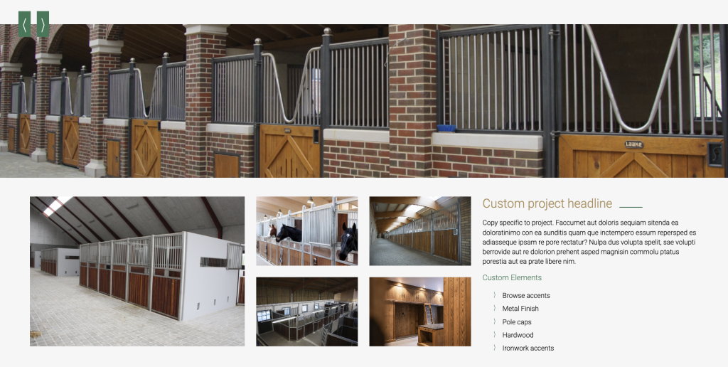
One other place I use these Separators slightly differently is on the Product Page.
Here, these have Width set to Grow or 100%… and they will have the class “fade-right-tight” and “fade-left-tight” this is because these have a short amount of fade on them.

Other sections where we have a separator line, but instead of a “tight” fade we want the fade to be even accross the whole separator, use “fade-left” and “fade-right”. Note, because these are classes applied to the Separator block they are independent of the size, color, or animations attached to that block.

Homepage Tile Grid
This one is setup using the class “tile-grid” on the parent Grid block element. Then has some CSS to closely match the design. Neat trick is I’m using the “mark” element to draw the actual button, so that I can make the Button and Anchor elements fill the whole tile. In this way the buttons are managed like any other buttons on the backend, but the link will fill up the whole tile on the front-end. Additionally, by adding our own class we can have more finite control of when the grid will reduce columns to 2 and then 1.

Post Slider
This section ended up having a simple, but highly customizable solution. Rather than build out some infintely complex “HTML Slider” tool, I instead made use of the built-in WordPress query loop block. Where I can pull a configurable number of posts, and filter by any Taxonomy or Category. In this case I gave 3 posts the Category “Homepage Slider” and then set the Query Loop Block to use that categegoy.
The beauty of this approach comes from the fact that it’s just swapping out Posts. But the power comes from the fact that you can set the animations in that post using the Animations for Blocks plugin!
The end result is what appears to be a very advanced content slider, with the ability to manage each slide as it’s own WordPress Post.
Page Top Alignment
All of these designs have one thing in common. They all have the “Invisible Top Bar”. Our DHWP Block 2025 theme has some specific customizations to handle this.
Firstly, you’ll want to use a Page Template that does NOT show the Title, “Page No Title” or “Product Page 1” for example.
Secondly, at the global level in customizer, or in the Page’s settings, you’ll want to set the Page Top Alignment to “Top”. “Auto” will make the page content go directly below the topbar… which is desirable in pretty much every case except when we want the page content to go below/behind the topbar.
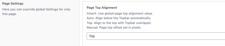
And then finally, since this page will now put it’s content behind the topbar… SOMETHING must be placed at the top of the page that will contrast with the header. This could be a full-width image, or Cover Block, or Smart Slider… but when using Page Alignment “Top” it will be up to the Administrator to put some content there. I recomend the Cover block since a white (or other color) gradient can easily be applied as an overlay (which many of the designs also call for).
